We recently carried out a poll asking ESPCF members to vote for an updated ESPCF logo. We didn’t have a huge number of responses, but the votes were helpful, and there were also some really valuable comments which helped decide the final changes.
While one of the three options had the majority of votes (52% – 16 out of 31 respondents), the second placed option was only behind by five votes (on 35% with 11 out of 31 respondents voting for it), which suggested that we should explore a middle ground. The following points, based on parent carer feedback from the poll, were important in our considerations:
- Using a sans serif font (in more technical terms that means one with no squiggly or sticky out bits on the end of the letters) to help with accessibility and legibility
- Retaining a warm, friendly feel and not being seen as ‘corporate’
- Avoiding using more than one font, to help with processing when reading
- Creating a connection between the font and the graphic (the three people icons)
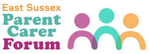
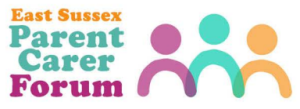
We think our new, updated logo meets these requirements and we hope you like it. As mentioned in our email bulletin to members, this work is not part of a big rebranding exercise – we wouldn’t have time for that even if we wanted to, and we really like our logo and colours. This update is being undertaken while we are redeveloping our website. As a result, the updated logo is not wildly different. However, we hope you’ll agree that it is warm, accessible, and recognisable as the forum.
![]()
![]()
Pictured: the two versions of our logo which we’ll be using.
The poll results
Option one
13% (4 votes out of 31)
Option two
52% (16 votes out of 31)
Option 3
35% (11 votes out of 31)